
How Small Businesses Can Make Website Contact Easier


Have you ever visited a tradesperson’s website because you wanted to make an enquiry, only to find yourself hunting around for their contact details?
I’ve lost count of the number of times I’ve found myself clicking through menu after menu looking for a phone number or email address, only to discover it’s hidden away in a dropdown or tucked away on a page that isn’t immediately obvious. By that point, it’s genuinely tempting to hit the back button and contact the next business on Google instead.
As business owners, we invest considerable time and budget into driving people to our websites. But there’s another question that’s just as vital: Once someone decides they want to contact your business, how easy have you made it for them?
Making contact should feel effortless. If a potential customer has already taken the time to find your website and likes what they see, the last thing you want is for unnecessary obstacles to get in the way of that lead.
Make contacting your business feel obvious
Your website should never leave visitors wondering what to do next. Whether someone wants to request a quote, book an appointment, or simply ask a quick question, the route to contacting you should be clear from almost every page.
Displaying your telephone number prominently in the header, providing a clearly labeled Contact page, and including simple calls to action throughout your site all help visitors take that next step with confidence.
Remember, visitors don’t know your website as well as you do. What seems obvious to you can be far less clear to someone visiting for the very first time.
Every extra click creates friction
Every additional step creates another opportunity for a potential customer to leave.
If visitors need to search multiple pages before finding your phone number, email address, or enquiry form, there’s a good chance some simply won’t bother, especially when comparing several local service providers at once. If one business makes reaching out effortless while another hides its details behind multiple clicks, the easier option almost always wins.
Small improvements to your layout can make a surprisingly big difference to your enquiry rate.
Make your calls to action stand out
Many small business websites provide excellent information about their services but never clearly tell visitors what to do next. Once someone has finished reading about your work, the next step should feel natural.
Instead of generic buttons, use clear, specific actions like:
-
Get a Free Quote
-
Book a Survey
-
Contact Us Today
Your calls to action should stand out visually without overwhelming the page. Good contrast, sensible positioning, and clear wording guide visitors towards making an inquiry without feeling pushy. The aim isn’t to pressure anyone, it’s simply to make taking that next step effortless.
Keep your contact form simple
Sometimes less really is more. A lengthy contact form asking for unnecessary details can discourage people before they’ve even started typing. For most local businesses, a name, contact details, and a brief message are all that’s needed to begin the conversation.
It’s also worth testing your contact form every so often. Website updates, plugin changes, and email spam filters can occasionally prevent enquiries from reaching your inbox without you realizing. Spending two minutes submitting a test enquiry every month could save you from missing valuable business.
Don’t interrupt visitors
AI chat widgets, newsletter pop-ups, and immediate discount banners have become popular, but timing matters. If someone has only been on your website for a few seconds, they haven’t yet had a chance to understand who you are, what you offer, or whether you’re the right business for them.
Giving visitors a little breathing space before presenting pop-ups or chat prompts creates a far better first impression. Sometimes the best user experience is simply allowing people to browse without interruption.
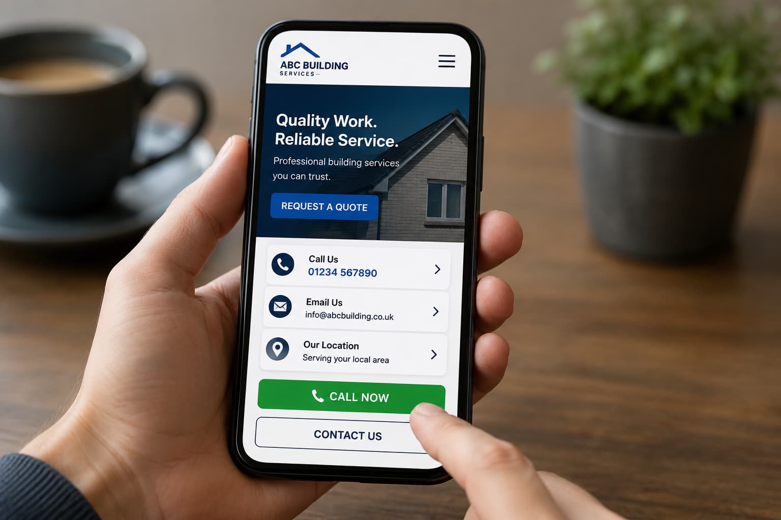
Think about your mobile visitors
For most local businesses, the majority of web traffic now arrives via mobile phones. Open your own website on your phone right now and ask yourself:
-
Is my phone number “click-to-call” so I can tap and dial immediately?
-
Can I find contact details without scrolling endlessly?
-
Is the enquiry form straightforward to fill out on a small screen?
-
Are buttons large enough to tap easily with a thumb?
Viewing your website through the eyes of a mobile user is often the fastest way to spot friction points that are costing you business.
Respond promptly
Making it easy to get in touch is only half the battle—responding promptly is just as important.
Many customers reach out to two or three local providers at once. Even if you’re out on a job and unable to answer fully straight away, acknowledging their enquiry lets them know they’ve been heard and creates an instant positive impression. A simple automated email confirmation reassuring them that their message was received can keep them from moving on to a competitor.
Put yourself in your customer’s shoes
One of the simplest exercises you can do today is to spend five minutes navigating your own website as though you’ve never seen it before.
Without using the main navigation menu, ask yourself:
-
How quickly can I find a phone number?
-
Is there an obvious way to send a quick message?
-
Am I being distracted by pop-ups before I’ve even read the page?
-
Is the next step completely obvious?
If the answer to any of those is “not really,” there’s a strong chance prospective customers are experiencing that exact same frustration.
Summary
Winning new clients isn’t always about driving more traffic to your website. Often, it’s simply about making life easier for the people who are already there.
By making your contact details obvious, keeping forms minimal, using clear calls to action, and ensuring mobile users can tap to call in seconds, you remove the barriers standing between a visitor and a paying customer.


